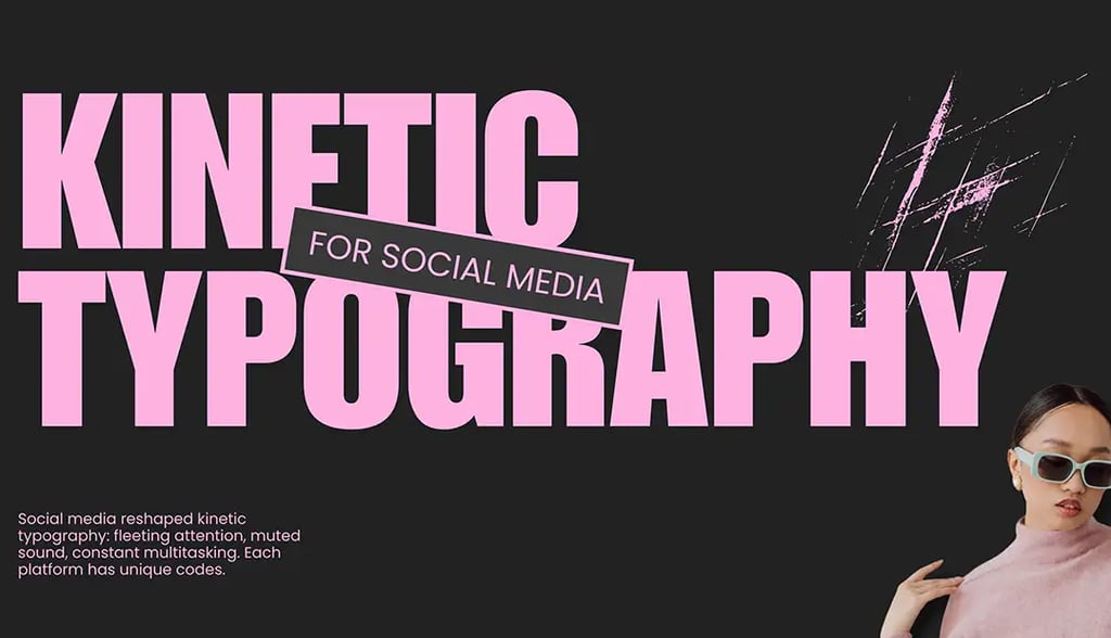
Kinetic Typography for Social Media
Social media has fundamentally changed the game for kinetic typography. We're no longer creating content for passive viewers sitting in darkened theaters or even watching attentively on their laptops. We're competing for attention from people scrolling through feeds at lightning speed, often with sound off, frequently while doing three other things simultaneously. Thekinetic typography strategies that worked five years ago—hell, even two years ago—don't necessarily
work today. Each platform has its own culture, user behavior, technical requirements, and algorithmic preferences. Treating them all the same is leaving performance on the table.
The Universal Truth: The First Second Matters Most
Before we dive into platform-specific strategies, let's acknowledge the one constant across all social media: you have approximately one second to stop the scroll. Maybe less. In that timeframe, your kinetic typography needs to communicate something compelling enough that someone chooses to pause and engage rather than continue scrolling.This isn't about being the loudest or most chaotic, it's about being immediately clear and intriguing.
The mistake most brands make is treating the opening moment as preamble. They ease in slowly, building to their point. That's storytelling for a captive audience. On social media, you need to lead
with impact. Your strongest message, your most compelling visual treatment, your clearest value proposition, that needs to be in the first second. Everything after that is bonus engagement from people who've already decided you're worth their time.
This means kinetic typography for social needs to be front-loaded in ways that other formats don't require. We're often putting the conclusion first, the hook before the setup, the payoff before the
build. It feels backwards from traditional narrative structure, but it's what platform behavior demands.
Instagram and Facebook: The Feed Scroll Challenge
Instagram and Facebook feeds move fast, and users are trained to scroll aggressively. Your kinetic typography here needs high contrast, clear messaging, and enough visual interest to create that crucial pattern interrupt. The optimal length is typically fifteen to thirty seconds, long enough to communicate something meaningful, short enough that completion rates stay high.
Text size matters enormously on these platforms. Mobile screens are small, and many users are scrolling in suboptimal lighting conditions. If your typography is too small or too subtle, it's invisible. We typically recommend text that occupies at least twenty to thirty percent of the frame for key messages. That feels large when you're designing on a desktop monitor, but it's necessary for mobile
readability.
Instagram specifically rewards native-feeling content. Kinetic typography that looks too polished or corporate often underperforms compared to content that feels more organic and authentic. This
doesn't mean sloppy, it means matching the aesthetic expectations of the platform. Sometimes we'll intentionally add slight imperfections or use less formal animation styles to make content feel more native.
Stories and Reels have their own requirements. Vertical format is non-negotiable, and the pacing needs to be quick. Stories disappear after twenty-four hours, so users consume them differently, often watching multiple in rapid succession. Your kinetic typography here can be more experimental and less polished because the context is temporary and casual. Reels compete directly with TikTok, so entertainment value matters as much as message clarity.
At Ultratype, we've found that Instagram Reels perform best with kinetic typography that integrates with the platform's native text tools aesthetically, even when created in professional software. Users
are accustomed to a certain look, and matching those expectations while exceeding the execution quality creates the best engagement.
TikTok: Where Entertainment Is Everything
TikTok operates on fundamentally different principles than other platforms. It's not a social network in the traditional sense, it's an entertainment platform. Users come to be entertained, not to catch up with friends or consume brand content. This has huge implications for kinetic typography strategy.
First, sound-on consumption is the default on TikTok. Unlike Instagram or LinkedIn where most content is watched muted, TikTok users expect audio. This means audio-reactive typography and tight sync between text and sound aren't just nice-to-have, they're essential. Typography
that doesn't dance with the audio feels disconnected and underperforms.
The aesthetic on TikTok skews younger and more experimental. Kinetic typography can be bolder, weirder, more chaotic than it would be on LinkedIn or even Instagram. Users expect creative risk-taking. They reward originality and punish content that feels corporate or overly produced. This is where brands often struggle, their instinct toward polish and professionalism works against them on TikTok.
Pacing on TikTok is aggressive. The platform rewards rapid cuts, quick transitions, and high information density. A thirty-second TikTok might communicate three to four distinct messages where a thirty-second Instagram Reel might focus on one. Your kinetic typography needs to match this intensity without becoming overwhelming.
We've noticed that TikTok's algorithm particularly rewards completion rate and re-watches. Kinetic typography that builds to a satisfying payoff, a punchline, a surprising reveal, a perfect sync moment, encourages people to watch again, which signals quality to the algorithm and increases distribution.
LinkedIn: Professional Context, Different Rules
LinkedIn is the outlier in social media, and kinetic typography strategies that work elsewhere often fall flat here. The audience is in a professional mindset. They're looking for insights, industry
news, career content, and business-relevant information. Entertainment value matters less than substance and credibility.
Kinetic typography on LinkedIn should enhance professionalism rather than distract from it. This typically means cleaner animations, more restrained motion, and pacing that allows for actual information absorption. Users are more likely to read longer text on LinkedIn than on other platforms, so your typography can carry more detailed messaging.
That said, motion still matters. Static posts consistently underperform video content even on LinkedIn. The key is using kinetic typography to make complex information digestible rather than just
grabbing attention. We're often using motion to reveal data progressively, emphasize key statistics, or guide viewers through multi-step explanations.
Length tolerance is higher on LinkedIn. While other platforms punish anything over sixty seconds, LinkedIn users will watch two to three-minute videos if the content is valuable. This creates
opportunities for more comprehensive kinetic typography treatments that explore topics with depth.
One LinkedIn, specific strategy we use at Ultratype: text-heavy kinetic typography with minimal other visuals. On platforms like Instagram, you'd never lead with dense text. On LinkedIn, it can work because users are there to read and learn. The kinetic treatment makes the text engaging without sacrificing information density.
Twitter/X: Speed and Brevity
Twitter's culture prioritizes speed, wit, and brevity. Videos autoplay in feeds, but users scroll incredibly quickly. Your kinetic typography here needs to communicate in seconds, not tens of seconds. Optimal length is typically six to fifteen seconds, just long enough to make a
point.
The character-limited text culture of Twitter extends to video content. Users expect concise communication. Kinetic typography that's too elaborate or takes too long to get to the point feels
off-platform. We're often creating typography animations that communicate a single, punchy message rather than attempting comprehensive storytelling.
Twitter users are also more likely to engage with text-based memes and cultural references. Kinetic typography that riffs on current events, trending topics, or internet culture performs is proportionately well. This requires staying culturally current and being willing to move
quickly on timely content.
One technical consideration: Twitter compresses video aggressively, especially on mobile. This means kinetic typography needs higher contrast and larger text than you might use on platforms with better video quality. Fine details and subtle effects often get destroyed in compression.
YouTube: Long-Form Opportunities
YouTube operates completely differently from other social platforms. It's not about stopping a scroll, it's about earning sustained attention. Kinetic typography on YouTube serves different functions:
title sequences, chapter markers, key point emphasis, information graphics, and call-to-action elements.
The audience on YouTube has already committed to watching, so your kinetic typography can support the content rather than carry it entirely. This allows for more sophisticated, nuanced motion design. You can build motion systems that evolve over the course of a video rather than frontloading everything in the first three seconds.
YouTube also allows for much higher production values. The platform supports higher resolution, better compression, and longer watch times. This means kinetic typography can be more detailed and refined without worrying about mobile compression destroying your work.
Chapters and timestamps are crucial on YouTube, and kinetic typography can help signal these transitions. Visual consistency in how you handle chapter markers creates a familiar viewing experience that keeps people engaged across longer content.
Platform-Agnostic Principles That Still Apply
While each platform has unique requirements, some principles remain constant. Readability is non-negotiable everywhere—if people can't read your text, the motion is irrelevant. High contrast between text and background works across all platforms. Clear hierarchy that guides viewers to the most important information performs universally.
Mobile-first design is essential across every platform. Even YouTube, which people still watch on desktops, is predominantly consumed on mobile devices. If your kinetic typography doesn't work on a phone screen, it doesn't work.
Testing is platform-specific. What performs well on Instagram might bomb on LinkedIn, and vice versa. We're constantly running A/B tests to understand what motion styles, pacing choices, and messaging approaches work best for each platform and audience combination.
The Multi-Platform Distribution Problem
Here's the reality most brands face: they need content that works across multiple platforms. Creating entirely bespoke kinetic typography for each platform is ideal but often not practical. The
solution is designing modular systems that can be adapted platform, specifically without requiring complete recreation.
At Ultratype, we often create master compositions with the most stringent requirements in mind—typically vertical format, large text, and aggressive pacing for TikTok and Instagram Reels. We then adapt these for other platforms: extracting horizontal crops for YouTube, slowing pacing for LinkedIn, creating condensed versions for Twitter. It's not as good as platform-native creation, but it's a practical compromise that maintains quality while respecting production realities.
The key is understanding which elements are platform-critical and which are flexible. Text size and readability requirements vary by platform. Pacing expectations differ dramatically. Audio dependency is platform-specific. But core messaging, brand consistency, and fundamental motion principles can often remain constant across adaptations.
Social media platforms will continue evolving, and kinetic typography strategies need to evolve with them. What works today might not work in six months. The brands seeing consistent performance are the ones treating social kinetic typography as an ongoing practice rather than a one-time execution, constantly testing, learning, adapting, and optimizing for how people actually consume content on each specific platform. That's not just good motion design. That's smart marketing.
325 Hudson St 4th Floor
New York, NY 10013
newbiz@ultratype.tv
+1 (646) 828-8262