About the project:
Details
Pharmaceutical Kinetic Typography Video
Client: Shire
Year: 2024
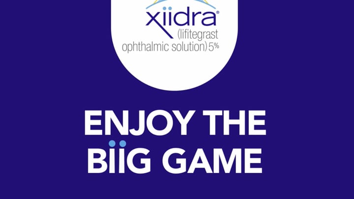
Xiidra's marketing team approached us to create an engaging awareness video that would break through the typical pharmaceutical advertising noise. Our mission was to transform their dry eye disease message into a playful kinetic typography experience using the brand's distinctive double-i wordmark as animated characters.
Xiidra - Kinetic Typography Video
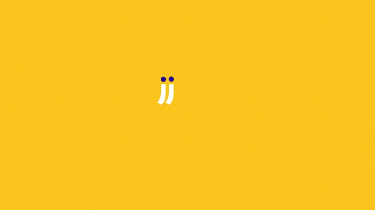
The animation builds from simple movements, a falling chip, a glob of dip—to more complex character interactions, all executed with precise timing and weight. The double-i's aren't just animated; they're performed, with gestures and movements that feel surprisingly human.
This transforms what could have been a straightforward educational message into something genuinely entertaining.

We transformed Xiidra's dry eye awareness message into a playful kinetic typography experience that speaks the brand's unique visual language. Working with the distinctive double-i wordmark, we created a series of animated vignettes that bring common game day distractions to life through pure type.
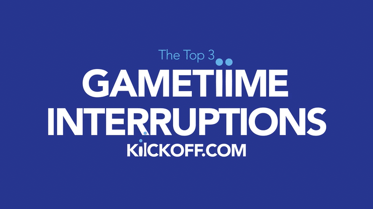
The piece opens with a countdown format "Top 5 Gametime Distractions", setting an energetic rhythm that carries through five increasingly absurd scenarios. Lowercase i's become characters themselves: clustering around TVs during commercial breaks, transforming into romping puppies, and literally walking into screens while distracted by their phones. Each vignette uses Xiidra's brand palette of vibrant blues and yellows to create a cohesive visual world where letterforms move, interact, and behave with personality.
The piece concludes by pivoting from playful distraction to medical clarity, maintaining the kinetic energy while delivering Xiidra's core message about dry eye disease symptoms. The typography shifts from character to messenger, demonstrating how motion design can bridge entertainment and pharmaceutical communication.
Working within pharmaceutical advertising guidelines, we created something that feels less like a medical message and more like a mini episode proof that even regulated industries can embrace bold, character-driven typography when the concept is right.
Expressive Typography That Captivates
Every typographic choice is intentional, from bold, impactful lettering that commands attention to fluid, cursive flows that echo continuous movement. The text doesn't just appear; it performs, creating an immersive experience where viewers feel the energy of the sport through the motion of words.
This is kinetic typography at its most expressive: transforming language into a dynamic visual force that celebrates both the physical and creative art of movement.
You can also explore other examples of kinetic typography videos we’ve produced, including one for a major Netflix event in New York, a powerful fintech text animation for R15K AI, a sports piece called Run4Life (an energetic mix of dynamic kinetic type and live-action running scenes), a luxury video for Chanel Chance, and an text driven intro for the Twilio Signal convention.
Send us your info and a few details about your project.
We’re ready when you are.
Let’s talk?
325 Hudson St 4th Floor
New York, NY 10013
newbiz@ultratype.tv
+1 (646) 828-8262